Float Examples
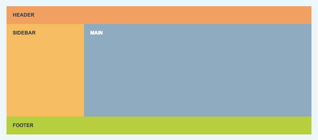
Example 01
This example has been done for you. It's a fairly common 2-column layout with a header and a footer. Take a look at example-01.css to see how.
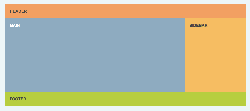
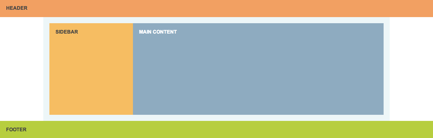
Example 02
Make me look like Example 01; a sidebar and main content floated next to each other with a cleared footer.
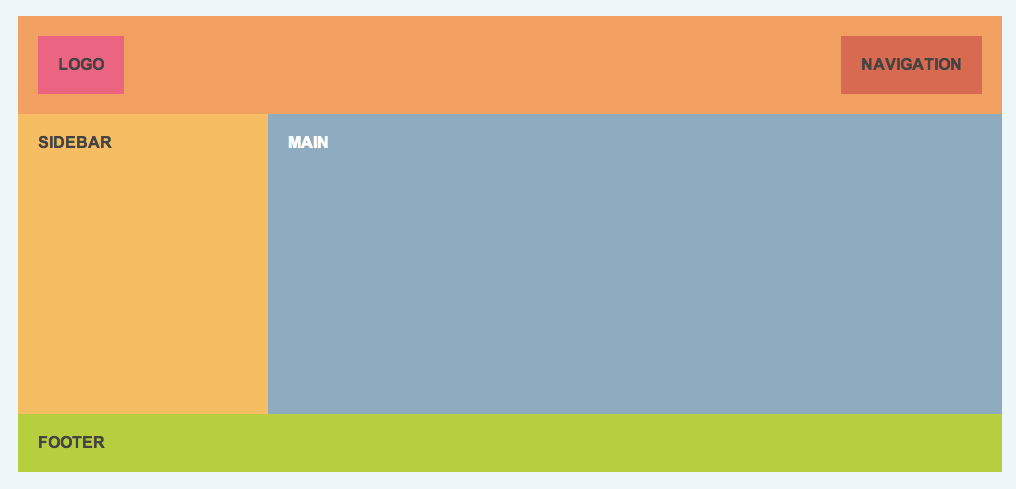
Example 04
Make me look like Example 01. Float the logo to the left of the header and navigation all the way to the right. Make sure the header contains them!
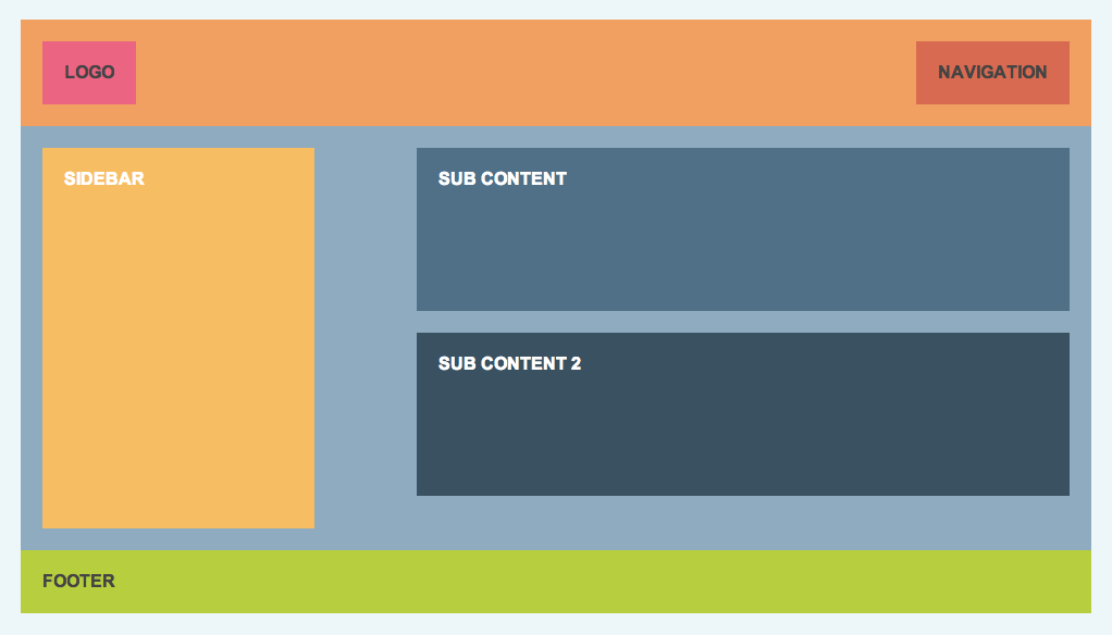
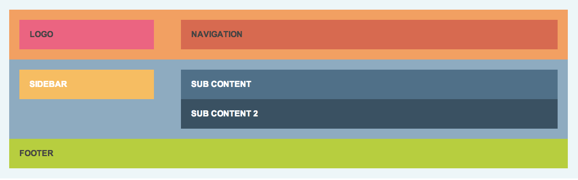
Example 05
Float the logo left and nav right in the header. Then make the sidebar float to the left of the two sub content divs, which should stack on top of each other. The footer should clear.
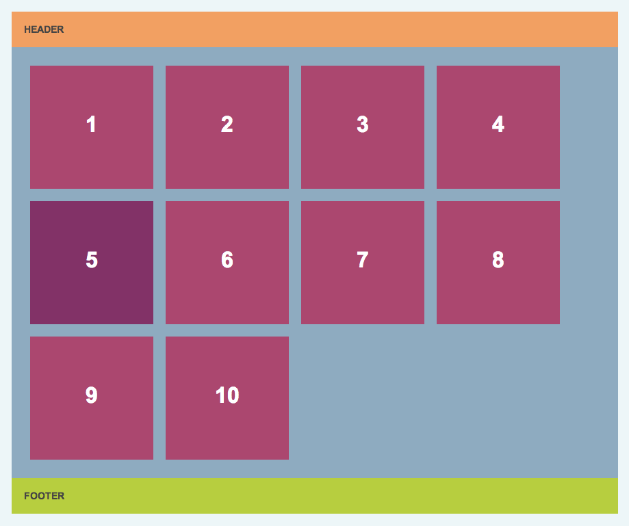
Example 06
Make all the widget float next to each other in a grid. What happens when you change the width of .container? What happens when you change float: left to float: right? What about when you make one of the widgets tall?
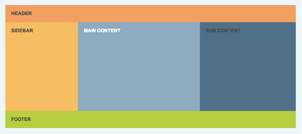
Example 07
Make me look like Example 05, with the stacked sub-content divs floated beside the sidebar. This time, use fluid percentage widths instead of pixel values! See what happens when you resize your browser window. Where does it break?
Example 09
Make a 3 column layout like Example 08, but make the header the full width of the browser, not just the container div. This one will require writing and deleting some HTML, too!
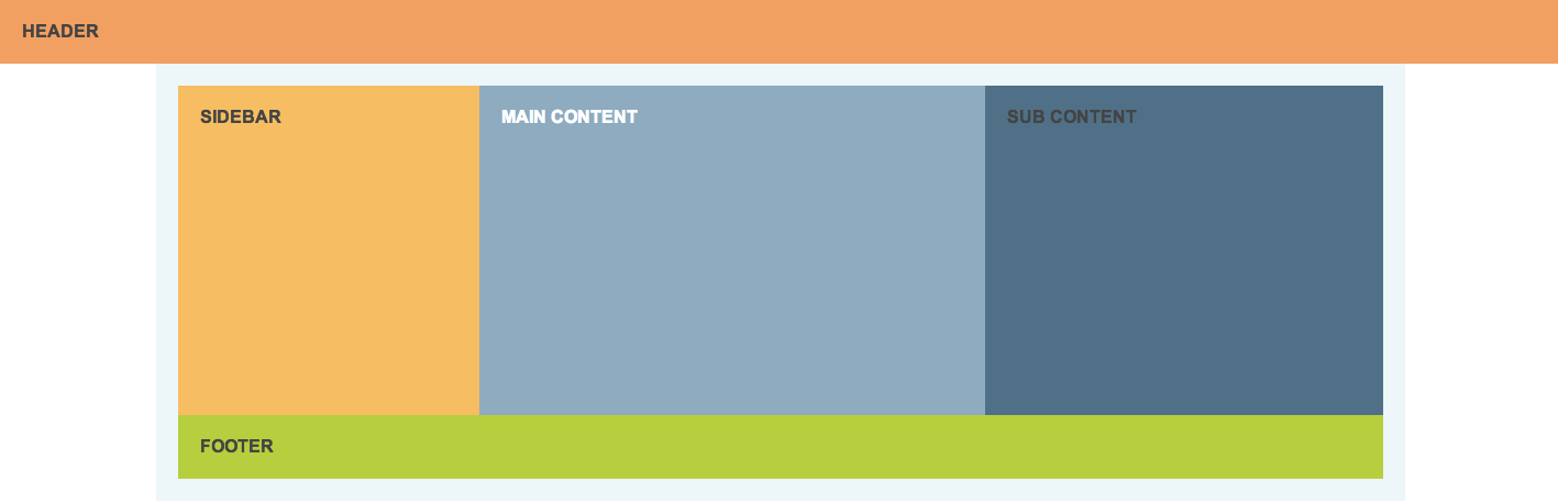
Example 10
Make the header and footer the full page width, but keep the sidebar and content divs constrained.
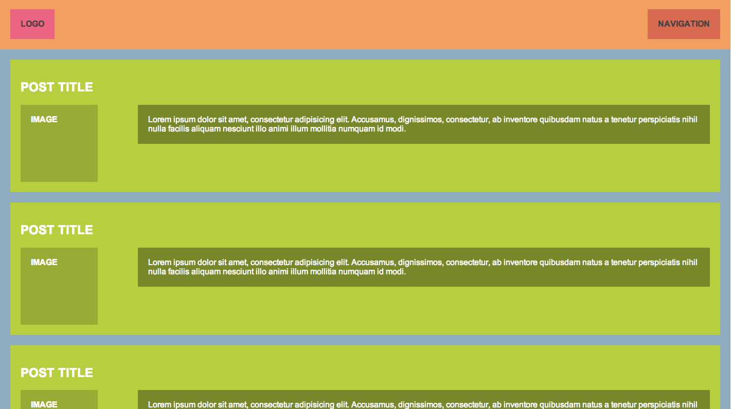
Example 11
Make a blog-like layout with a header, and a set of blog posts that are an image and a paragraph floated next to each other.
Example 12
Style this To Do list. You'll need to use floats to align the priority icon, title, and checkbox with each other, and margin and padding to correctly space the to do item elements. Be sure to style the rest of the elements like the photo; you'll need to use margin, borders, background, font-size, and padding!
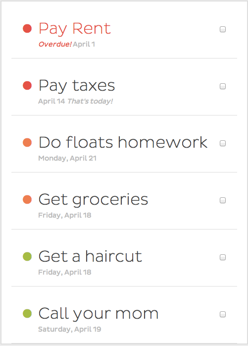
Example 13
Create a layout of your choosing!